
#Pure Earnings Play
- Getting the data and writing the function
- Top sectors and stocks from results
- Beautiful plots to visualize the results
- Quick review
- How to improve the simple strategy
You often hear two things when watching or reading financial news. One is earnings season, and another is quantitative trading. Most people prefer to manage their own money and pick the companies their most familiar with when making trading decisions. I’m going to integrate the two to talk about the performance of a simple earnings trade strategy across the NASDAQ and how it compares against a basket of popular stocks. I wanted to compare it to a group of popular names from the NASDAQ to simulate the “go-to” names for the average mom-and-pop investor. These popular names will include Facebook, Apple, Amazon, Netflix, Google, and many more to see if these Wall Street darlings are also the best ones to trade during earnings. After all, if these companies are doing so well then their earning results should reflect that.
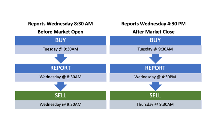
###The Process The trading strategy is kept simple to illustrate the common approach to trade earnings. The strategy will buy the stock at the market open one day prior to the earnings release date, and if the company reports BEFORE the market open, then we will sell at the market open. If the company reports AFTER market close, then we will sell it the following day at the market open. See below to see how the trades are triggered.
We are going to use this strategy and scale it out to each stock in the NASDAQ with a market cap over $5Billion. This is when the computers take over because we want to run this across thousands of different stocks and then run additional scripts on the results. A great trader usually focuses on a core set of stocks, whereas a computer can keep track of tens of thousands at a fraction of the time.
###The Data All of our stock data (with exception of earnings dates) comes from an R package called “tidyquant” that uses yahoo, quandl, alphavantage, bloomberg, etc. for pricing data. First, we gather the NASDAQ exchange data and drop all stocks that do not have a Billion $ market cap, then filter out all companies that are under a $5 Billion market cap. After, we will map a pricing function to all stocks that passed our market cap screening to obtain the historic pricing data since the start of 2016. Finally, I will drop any rows that may contain NA values. After filtering through the NASDAQ, there are 282 stocks remaining that meet our criteria. I’ll also need to get all of the quarterly earnings dates for each stock during our specified time period. I will web scrape the data from a reputable source online in order for me to get accurate historic earnings data for each stock. I am saving $$$ by getting the data this way. Let’s look at the results through a variety of different visualizations, starting with a Lollipop chart to illustrate the top performing sectors by overall total returns.
###Top Sectors
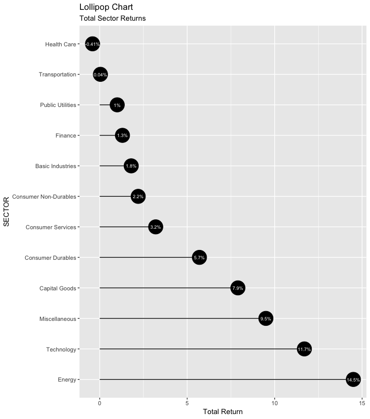
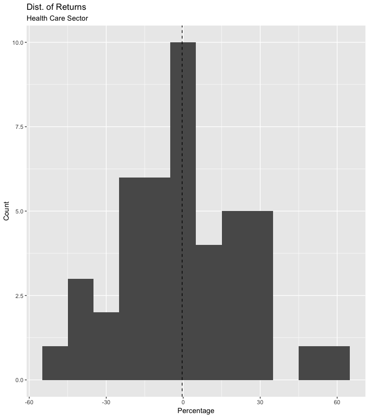
Being that we are backtesting the NASDAQ, I was quite surprised to see only one sector at a loss and the Energy coming out on top. After looking a little deeper, I found that only two stocks were responsible for the Energy Sector coming out on top. If additional energy companies would have made it through our initial Market Cap screening, then most likely Technology would have taken the #1 spot. Since this was such a simple strategy, I was very surprised to see only one sector at a loss. To see if only a few companies were responsible for the overall loss or if the losses were evenly spread out through the sector, we view the distribution on a histogram. After taking a quick look, it is clear to see that the returns are pretty normally distributed. Below is a table that lists each Sector by total overall returns and the number of companies in each sector.
## # A tibble: 12 x 3
##    SECTOR                OVERALL.RTRN Companies
##    <chr>                        <dbl>     <dbl>
##  1 Energy                       14.5          2
##  2 Technology                   11.7         92
##  3 Miscellaneous                 9.5         12
##  4 Capital Goods                 7.9         15
##  5 Consumer Durables             5.7          2
##  6 Consumer Services             3.2         60
##  7 Consumer Non-Durables         2.2         10
##  8 Basic Industries              1.8          3
##  9 Finance                       1.3         30
## 10 Public Utilities              1            4
## 11 Transportation                0.04         8
## 12 Health Care                  -0.41        44
###Histogram: Returns for each company in the Health sector.
###Top Stocks
Now, let’s take a look at the Top 40 performing stocks by total return using the same Lollipop chart. Do you notice any of the big names, like Amazon or Apple? I’ll also print a table showing the top 100 stocks by overall total return, number of trades, and the sector it is in.
## # A tibble: 282 x 4
##     Symbol OVERALL.RTRN `# of Trades` SECTOR
##     <chr>         <dbl>         <dbl> <chr>
##   1 ETSY           85.0            12 Miscellaneous
##   2 LOPE           77.4            13 Consumer Services
##   3 LOGI           72.0            13 Technology
##   4 UBNT           71.5            13 Technology
##   5 SPLK           67.1            12 Technology
##   6 PODD           60.5            12 Health Care
##   7 ANGI           58.0            13 Consumer Services
##   8 EXEL           48.7            13 Health Care
##   9 WB             48.4            12 Technology
##  10 TTWO           46.8            13 Technology
##  11 OKTA           45.7             7 Technology
##  12 FIVE           44.3            12 Consumer Services
##  13 RP             43.9            12 Technology
##  14 YNDX           43.3            13 Technology
##  15 BRKR           41.9            13 Capital Goods
##  16 GRMN           41.1            13 Capital Goods
##  17 COLM           39.1            13 Consumer Non-Durables
##  18 ZBRA           39.0            13 Technology
##  19 ASML           37.5            13 Technology
##  20 CDNS           36.6            13 Technology
##  21 LRCX           34.7            13 Technology
##  22 TEAM           34.2            13 Technology
##  23 NVDA           34.0            13 Technology
##  24 ULTI           33.3            13 Technology
##  25 ADSK           33.3            12 Technology
##  26 AVGO           33.0            12 Technology
##  27 TSLA           32.1            13 Capital Goods
##  28 XLNX           31.8            13 Technology
##  29 SSNC           31.6            13 Technology
##  30 PEGA           31.6            13 Technology
##  31 CGNX           31.4            13 Capital Goods
##  32 MCHP           30.8            13 Technology
##  33 ADI            30.7            13 Technology
##  34 NFLX           30.5            13 Consumer Services
##  35 EWBC           30.4            13 Finance
##  36 ADBE           30.2            12 Technology
##  37 MASI           30.2            12 Health Care
##  38 MXIM           29.7            13 Technology
##  39 SNPS           29.5            13 Technology
##  40 EXAS           29.4            13 Health Care
##  41 IAC            28.6            13 Consumer Services
##  42 ALXN           28.2            13 Health Care
##  43 NDSN           26.6            13 Capital Goods
##  44 QGEN           26.5            12 Health Care
##  45 IDXX           25.4            13 Health Care
##  46 MRVL           24.5            12 Technology
##  47 FB             24.0            13 Technology
##  48 MSFT           23.7            13 Technology
##  49 ISRG           23.4            13 Health Care
##  50 PRAH           23.2            12 Health Care
##  51 FTNT           23.2            13 Technology
##  52 ROKU           22.8             6 Consumer Services
##  53 MOMO           22.3            12 Technology
##  54 AMRN           22.2            12 Health Care
##  55 ON             22.1            13 Technology
##  56 AMAT           21.8            13 Technology
##  57 ACGL           21.6            13 Finance
##  58 COUP           21.5             8 Technology
##  59 MELI           21.1            12 Miscellaneous
##  60 CSCO           20.9            13 Technology
##  61 MORN           20.3            13 Finance
##  62 NICE           19.5            13 Technology
##  63 RYAAY          19.5            13 Transportation
##  64 AZPN           19.4            13 Technology
##  65 CSX            19.2            13 Transportation
##  66 WIX            19              13 Technology
##  67 HAS            18.8            13 Consumer Non-Durables
##  68 TER            18.7            13 Capital Goods
##  69 AMZN           18.6            13 Consumer Services
##  70 MU             18.1            12 Technology
##  71 CTXS           17.7            13 Technology
##  72 FANG           17.7            13 Energy
##  73 LAMR           17.4            13 Consumer Services
##  74 BIIB           17.3            13 Health Care
##  75 ARRS           17.3            13 Technology
##  76 KLAC           16.7            13 Capital Goods
##  77 ALGN           16.7            13 Health Care
##  78 AAPL           16.6            13 Technology
##  79 ROST           16              12 Consumer Services
##  80 JD             15.7            12 Consumer Services
##  81 VRSN           14.9            13 Technology
##  82 TRMB           14.8            13 Capital Goods
##  83 JBHT           14.7            13 Transportation
##  84 MDB            14.4             5 Technology
##  85 MYL            13.6            12 Health Care
##  86 HTHT           13.4            12 Consumer Services
##  87 STLD           13.2            13 Basic Industries
##  88 PFPT           13.0            13 Technology
##  89 ZION           12.7            13 Finance
##  90 PYPL           12.7            13 Miscellaneous
##  91 ORLY           12.4            13 Consumer Services
##  92 BIDU           12.3            13 Technology
##  93 DXCM           12.2            13 Health Care
##  94 DISCB          12.1            12 Consumer Services
##  95 AKAM           11.4            13 Miscellaneous
##  96 TMUS           11.4            13 Public Utilities
##  97 WWD            11.4            13 Energy
##  98 WDC            11.2            13 Technology
##  99 LBRDK          11.1             9 Consumer Services
## 100 LBRDA          11.1            10 Consumer Services
## # … with 182 more rows
###Average Gains / Losses for Each Stock Traded
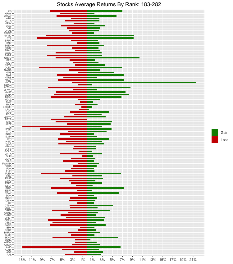
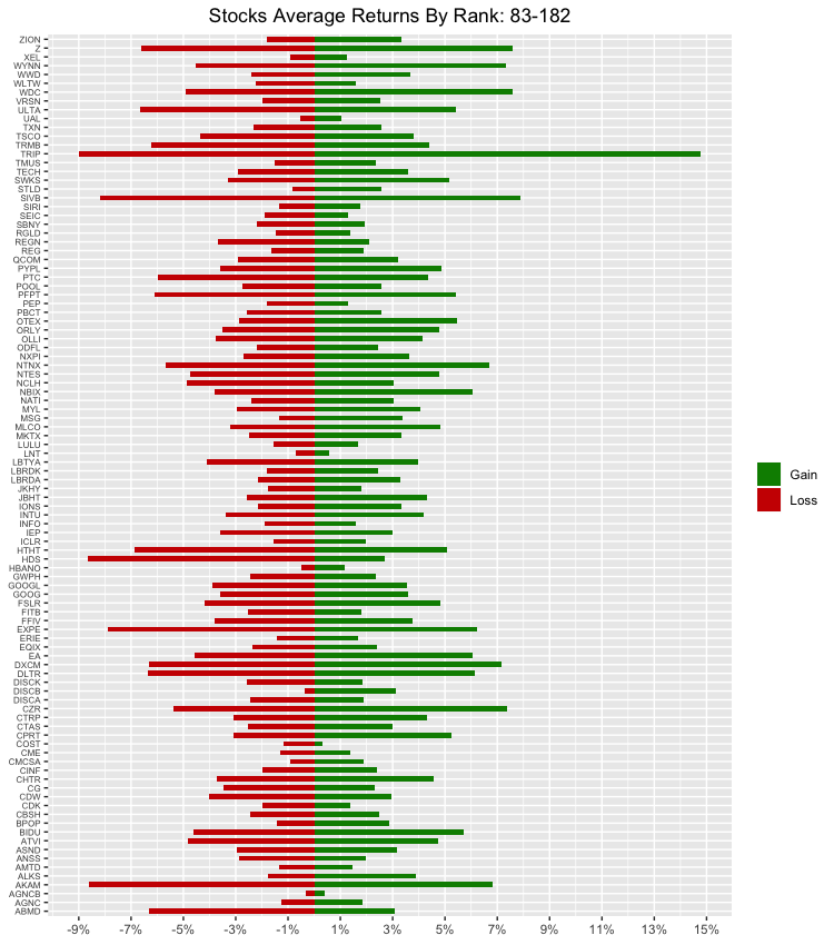
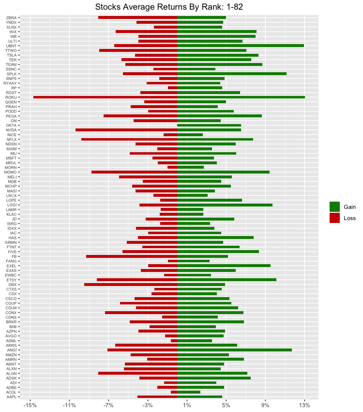
We have over 280+ stocks with each earnings trade since 2016. It would not be a good-looking chart if we threw all of those on one axis, or even over a layer of different grids. I think a diverging bar graph would suit this nicely. We can put 100 stocks on a graph and easily see the average gains and losses for each stock. We will start from the last ranked stocks by return and work our way down, so the first chart shows the top 183-282 stocks by return, and their respective gains and losses.
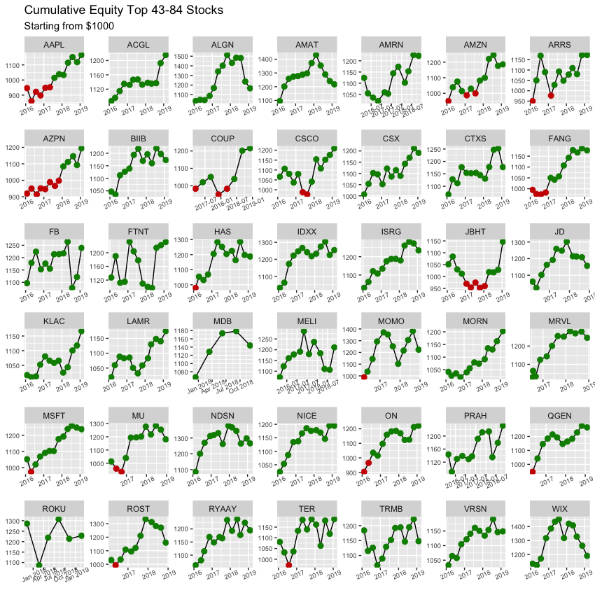
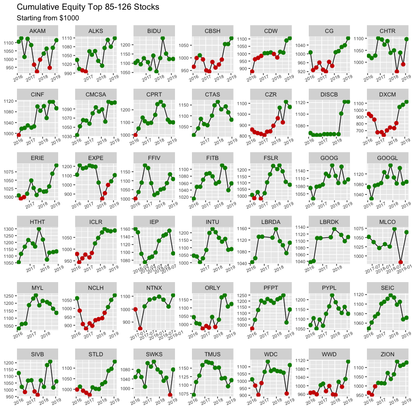
###Cumulative Changes in Each Stock Traded
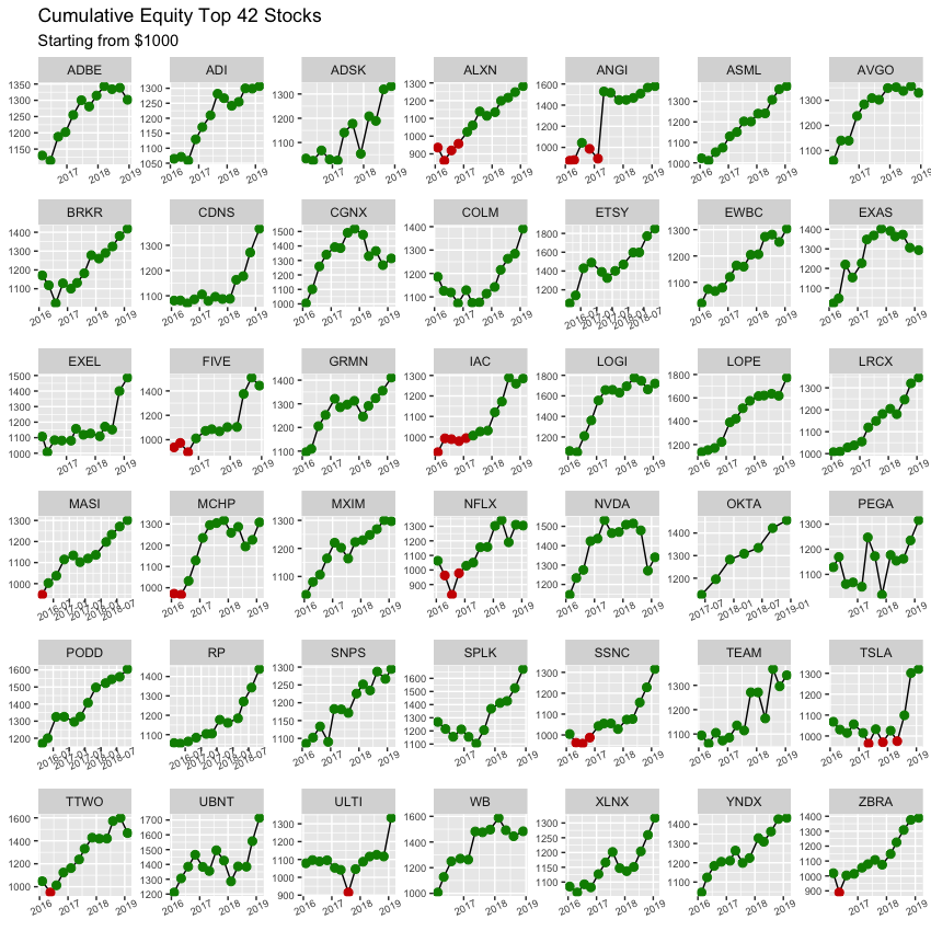
Now, we can create a few grids to illustrate the cumulative change for the total capital over the backtesting period if we were to allocate $1000 DOLLARS into each stock. If the bullet is GREEN, then that means we are at a profit and above our initial capital of $1000 DOLLARS, and if it’s RED then it means we are at a loss. Let us look at the top 126 stocks by return over three different grids.
###Surprise, Surprise
Were you expecting any of the above results? Did it surprise you to see the Energy sector come out on top or the lack of popular household stocks in the Top 10? I was pretty surprised to see ETSY come out on top as #1 for total returns at 85%, while EBAY (similar business model) came in at #192/282 for a total return of -3.53%. What about the overall return for the rest of the portfolio?
###Overall Returns
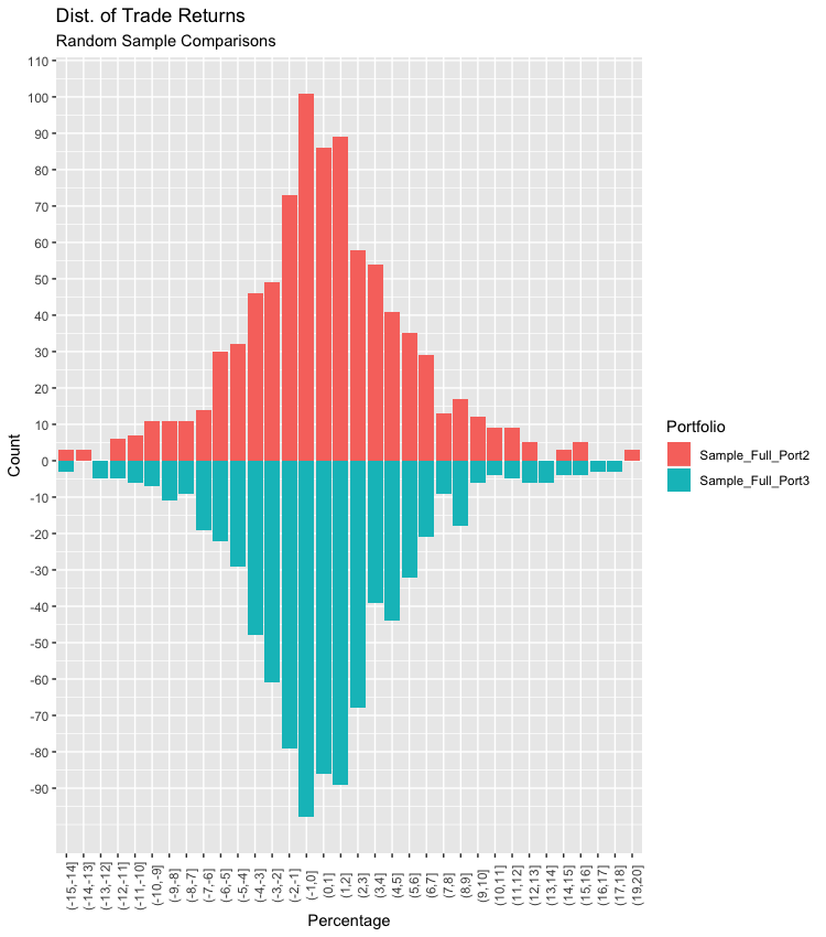
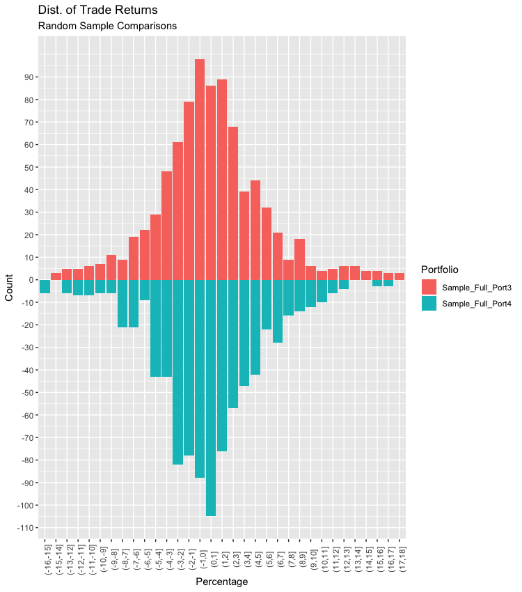
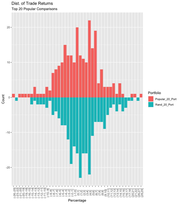
Let’s view the return distribution for EACH trade made on the Full Portfolio and compare that to random samples. Also, we will compare these returns against a basket of the 20 most popular stocks in the NASDAQ as well as 20 random stocks from the top100 ranked by total return. I classified the “20 most popular” names by researching the most widely held stocks in the NASDAQ, most active by dollar trading volume in NASDAQ, and NASDAQ stocks in Robinhood’s top 100 most popular list.
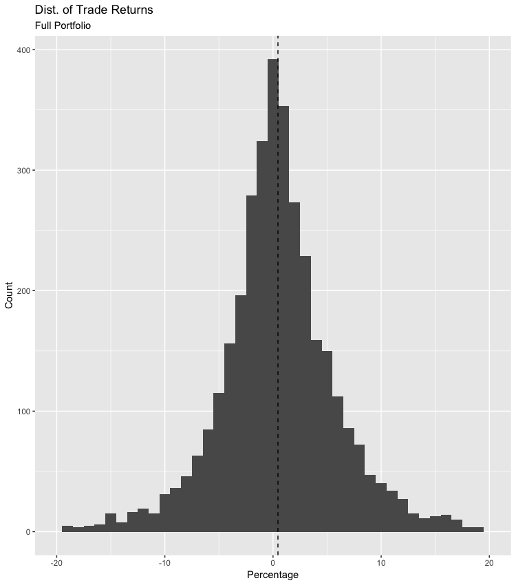
The returns for each trade made seem to be normally distributed, with exception of a few outliers. I removed those to get a cleaner view of the distributions, which we can see the average return for a trade is 46 basis points (or 0.46 percentage points). This is great considering there are over 3500 total trades. What about the overall return or the comparison to popular household names?
###Our Portfolio vs Sample Portfolios vs Most Popular First, I would like to compare the distribution of the trade returns to the distributions of the randomly selected samples from the Full Portfolio. I’m doing this to gauge how this simple strategy would perform if we were to just randomly select a group of stocks or a group of popular stocks. After, we can compare the overall returns from each portfolio to see how effective this trade is compared to just trading the Top 20 Most Popular household names.
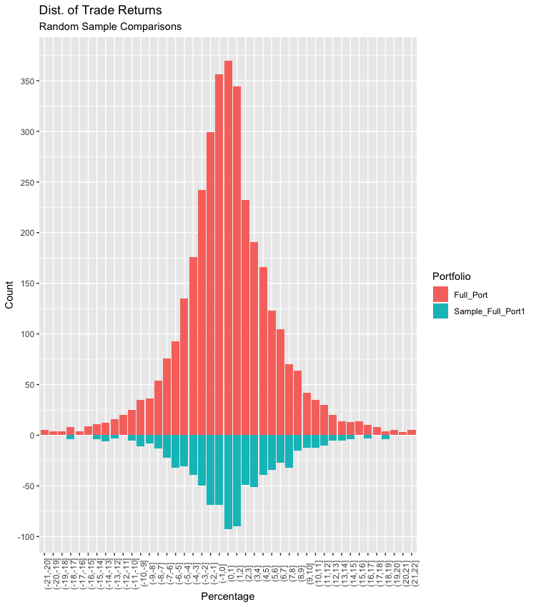
| Portfolio | Median Total Return | Mean Total Return | Avg Return Per Trade(plot) |
|---|---|---|---|
| Full_Port | 4.22% | 5.66% | 0.46% |
| Sample_Full_Port1 | 11.3% | 10.9% | 0.87% |
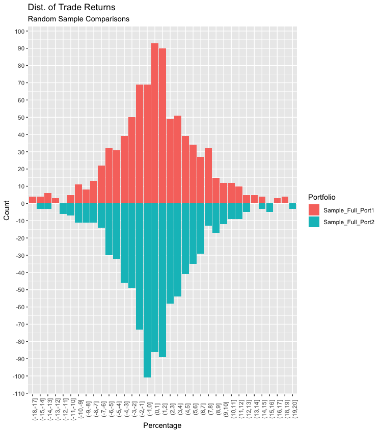
| Portfolio | Median Total Return | Mean Total Return | Avg Return Per Trade(plot) |
|---|---|---|---|
| Sample_Full_Port1 | 11.3% | 10.9% | 0.87% |
| Sample_Full_Port2 | 6.21% | 6.73% | 0.54% |
| Portfolio | Median Total Return | Mean Total Return | Avg Return Per Trade(plot) |
|---|---|---|---|
| Sample_Full_Port2 | 6.21% | 6.73% | 0.54% |
| Sample_Full_Port3 | 0.045% | 4.92% | 0.40% |
| Portfolio | Median Total Return | Mean Total Return | Avg Return Per Trade(plot) |
|---|---|---|---|
| Sample_Full_Port3 | 0.045% | 4.92% | 0.46% |
| Sample_Full_Port4 | 0.72% | 0.257% | 0.021% |
| Portfolio | Median Total Return | Mean Total Return | Avg Return Per Trade(plot) |
|---|---|---|---|
| Popular_20_Port | 16.1% | 12.6% | 1.04% |
| Random_20_Port | 21% | 28.8% | 2.29% |
Table for the overall gain / loss for each portfolio/sample above
## # A tibble: 7 x 3
##   Portfolio         MED.RTRN TOT.RTRN
##   <chr>                <dbl>    <dbl>
## 1 Full_Port             4.21     5.66
## 2 Sample_Full_Port1    11.3     10.9
## 3 Sample_Full_Port2     6.21     6.73
## 4 Sample_Full_Port3     0.05     4.92
## 5 Sample_Full_Port4     0.72     0.26
## 6 Most_Popular_20      16.1     12.6
## 7 Random_20_Top100     21.0     28.8
###Overall Returns Summary
As we can see, the total return from the start 2016 to Friday 3/8/2019 for the entire portfolio was 5.66%. Not bad for an extremely simple strategy! Although, if you were to use this strategy on the popular household names then you would have done better than using a sophisticated “algo” trader across the entire NASDAQ index. By using this simple buy and sell earnings play across the 20 most popular names in the NASDAQ, you could have returned 12.62% for the same time period. On the other hand, if you can use the computer to your advantage by training it to decide which stocks to run this simple strategy on, then it can greatly increase your returns. By running this simple strategy on 20 random stocks from the top 100, our returns shot up to 28.79% for the same time period.
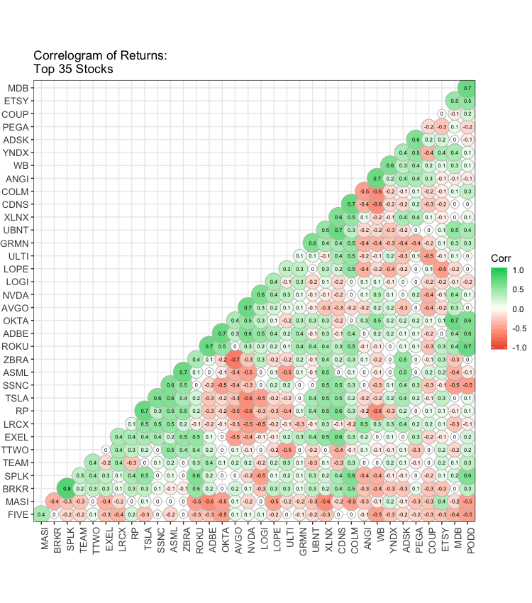
###Quick Look - Correlation Among Returns
Something interesting I thought I could look at was the correlation between the average earning returns for each stock. I’d like to see if any strong correlations above +/- 0.8 exist. If so then that can be something to help us decide which stocks to choose when initiating this simple earnings strategy. We will also do the same for the top 35 stocks.
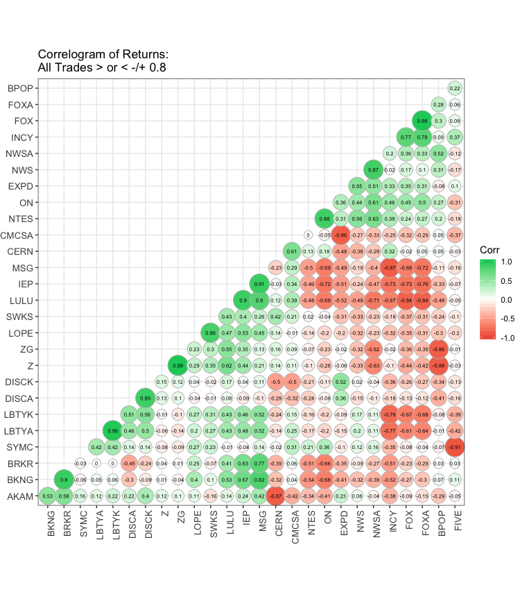
###What’s Next Overall, I’d like to fine-tune this simple strategy by maybe testing different buy/sell triggers, adding a couple of momentum indicators, getting intraday data, or even adding in a sentiment score going into earnings. I also want to check out what those high correlations are all about and backtest a pair trade strategy. I may create a continuation post to this and test out earnings pair trading strategies.
