
#Going, Going, Inverted! - Yield Curve inversions are typically a leading indicator for a recession - Historic analysis on inversions for specific yields since 1990 - Yield Curve over 5 different time frames since the start of 2018 - Takeaway from recent inversions
#Yield Curve Inversion I’ve always followed bank stocks ever since I first began investing almost six years ago. Once I learned the 10-year and 2-year treasury spread was a profit driver for the big banks, I started to track the daily fluctuations. These two interest rates are part of the larger yield curve that generally trends higher along the x-axis of a graph, while an “inverted” curve trends lower along the x-axis. The yield curve is widely spoken about so I will not get into too much detail but due to the inversion that first occurred earlier this month (December 3rd 2018), it is once again very popular in mainstream media. I’ve had this code that I wrote, posted and updated to github a few months back, and I use daily to view and analyze the daily movements. I’ve decided to make a quick post to visualize the yield curve over five different time frames since the start of 2018 and to look at how many times and when specific yields inverted.
#Why it matters - Quick Summary The yield curve matters because it can be a sentiment driver on the overall economy to many. Investors view any inversions in the yield curve as a sign that the economy may be heading into a recession. This is because an inversion happens when a shorter-term treasury note demands more yield than a longer-term note. You usually demand more for longer-term lending since you are incurring greater opportunity costs of the longer repayment schedules. Once lenders demand more interest for shorter-term notes, this can be a sign that they are not as confident in short-term notes due to a possible economic slowdown. Most investors want to be the first out the door in most companies if a economic slowdown was to actually come.
#Getting our Data
I am using a package called “ustyc” that web scrapes US treasury yield curve data from the US Treasury web site. I can load in 1990 to present time quickly using a mapping function such as map(yr, getYieldCurve) %>% map(2) %>% do.call("rbind", .) but it takes a bit of time to retrieve then convert all the data to its appropriate structures. For this reason, I save the historical data frame as a csv file and load it in to update when needed. This makes it much quicker to load the data rather than running the function to retrieve data from 1990 to 2018.
Once its loaded, I can begin data manipulation to gather the appropriate yields to further analyze. Let us first add a column of the ten/two year spread since I would like to see this daily. Once we do this, our data set dimensions are 7244, 10. That is over 94,000 observations that we have loaded in. Then, lets look at the YTD graph and historical of the 10/2-year spread to see how if there is any interesting trends.
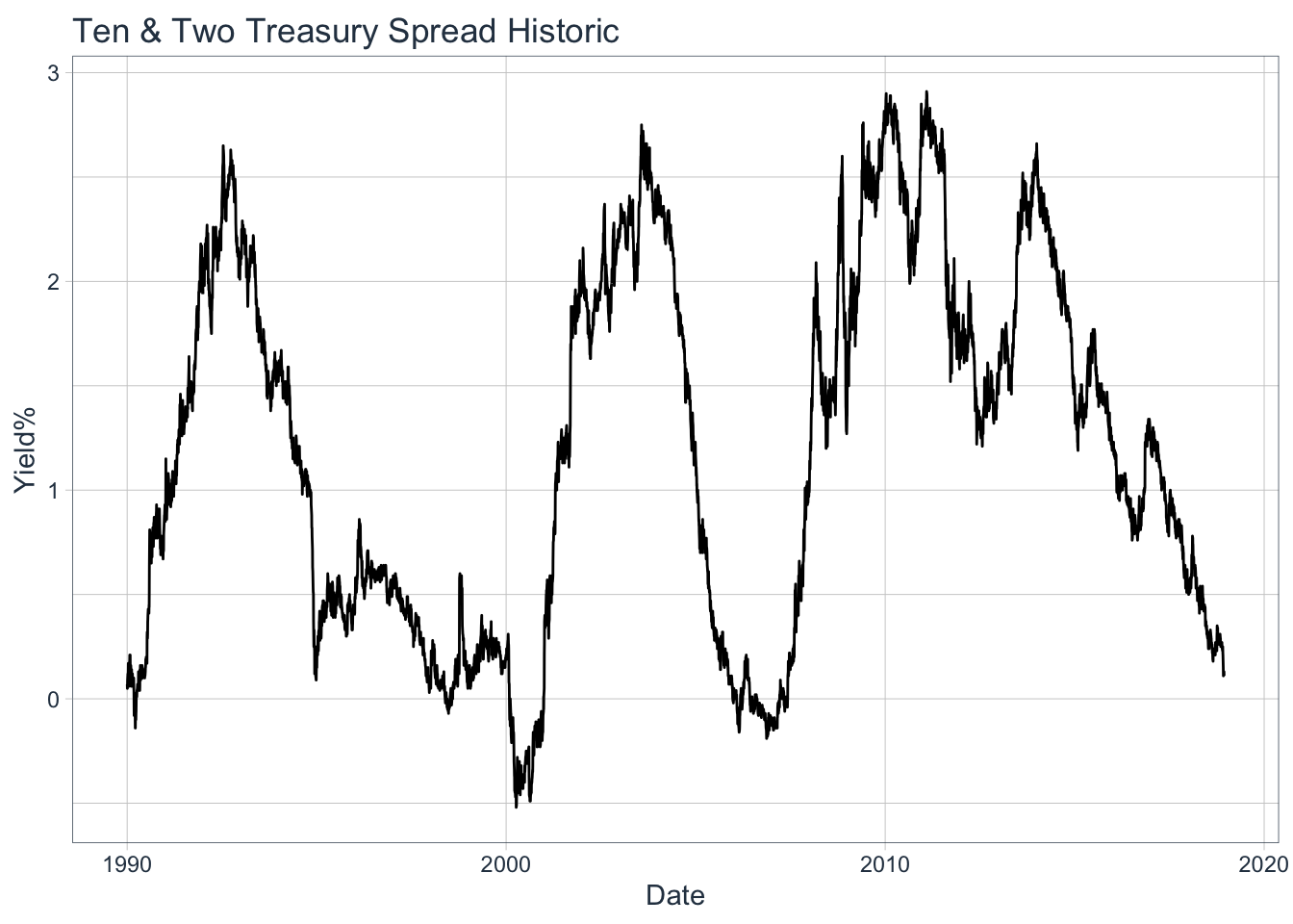
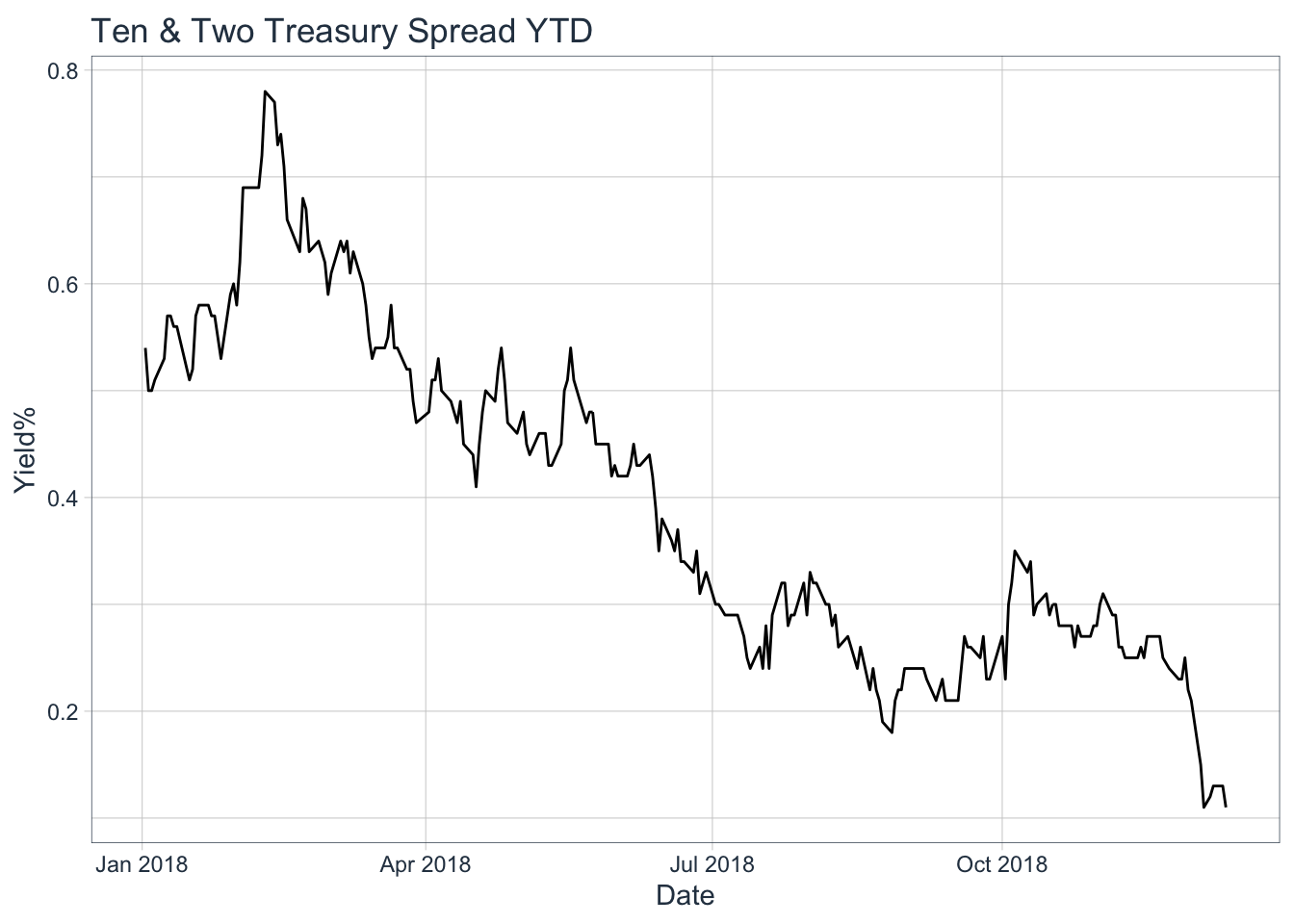
We can see there is a clear fluctutation throughout history within the range of -0.5 - under 3%. When we focus on just YTD, this shows a clear trend to the downside making new lows. On 12/4/18 the spread reached 11 basis points (0.11%), levels not seen since 2007-06-15, 2007-06-08, & 2006-04-21.
#Well what exactly inverted On 12-3-2018 we saw the 3-year and 5-year yield invert for the first time since 2007-06-05. Then the next set of yields to invert were the 2-year and 5-year yield on 12-4-2018 which has not inverted since 2007-06-06.
##       ref_date BC_3YEAR BC_5YEAR
## 644 2007-06-05     4.97     4.96
## 645 2018-12-03     2.84     2.83
## 646 2018-12-04     2.81     2.79
## 647 2018-12-06     2.76     2.75
## 648 2018-12-07     2.72     2.70
## 649 2018-12-10     2.73     2.71
## 650 2018-12-11     2.78     2.75
## ref_date BC_2YEAR BC_5YEAR
## 643 2007-06-06 4.97 4.94
## 644 2018-12-04 2.80 2.79
## 645 2018-12-07 2.72 2.70
## 646 2018-12-10 2.72 2.71
## 647 2018-12-11 2.78 2.75#Occurences that seperate pair of yields inverted Let us make a function that will filter through each year-yields (2-year,3-year,5-year,7-year,etc..), subset if it inverts, group by year-month, count the number of times that it inverted, and then plot it. Let us also include what I would classify as a “Across-the-board” true inversion, that is the 2-year yield greater than the 10-year which is greater than the 30-year yield (2yr > 10yr > 30yr). I would like to analyze the number of times each pair has inverted since 1990, why the inversion happened, when it happened, and how long it took after the first inversion to trigger a bear market.
num_inversion_plot <- function(data, nrow = 7, ncol = 1){
  indx <- colnames(data)[c(3:7,9)] #Only check the 2,3,5,7,10, & 30-year spreads.
  loop <- 1:7  #Loop 7 times since we want to graph 7 different pairs
  ls <- list() #Create empty list to store ggplots

  for(i in loop){
    if(i < 6){        #The first 5 graphs will come from this first if-statement
      b <- i + 1      # [i] will be used for 1st element, and [b] is used for 2nd

  #We take our data and select the first pair in the indx(1 and 2), only get days when
  #the short-term yield > long-term, count the # of days and group by year-mon then plot
      ls[[i]] <- data %>% select(ref_date,noquote(indx[i]),noquote(indx[b])) %>% subset(.[2] > .[3]) %>% {count(.,date = format(.$ref_date, "%Y-%m"))} %>% ggplot(aes(date,n)) + geom_col(fill = "lightblue") + theme(axis.text.x = element_text(angle = 65, hjust = 1)) + labs(title = paste("# of inversions for",indx[i],"&",indx[b], sep = " "), y = "Occurrences", x = "Date")

    } else if(i==6){  #Our 6th graph will be our first custom pair

      ls[[i]] <- data %>% select(ref_date, BC_2YEAR,BC_10YEAR) %>% filter(BC_2YEAR > BC_10YEAR) %>% {count(.,date = format(.$ref_date, "%Y-%m"))} %>% ggplot(aes(date, n)) + geom_col(fill = "lightblue") + labs(title = "# of inversions for BC_2YEAR & BC_10YEAR", y = "Occurrences", x = "Date")+ theme(axis.text.x = element_text(angle = 65, hjust = 1))

    } else {      #Our 7th graph will be our second custom pair

      ls[[i]] <- data %>% select(ref_date,BC_2YEAR, BC_10YEAR,BC_30YEAR) %>% filter(BC_2YEAR > BC_10YEAR & BC_10YEAR > BC_30YEAR) %>% {count(.,date = format(.$ref_date, "%Y-%m"))} %>% ggplot(aes(date, n)) + geom_col(fill = "lightblue") + labs(title = "# of complete yield inversions - 2yr > 10yr > 30yr", y = "Occurrences", x = "Date") + theme(axis.text.x = element_text(angle = 65, hjust = 1))

    }
  }
                #This will grab and output all ggplots in our list
        marrangeGrob(grobs = ls, nrow = nrow, ncol = ncol, top = NULL)
}

num_inversion_plot(my_yc)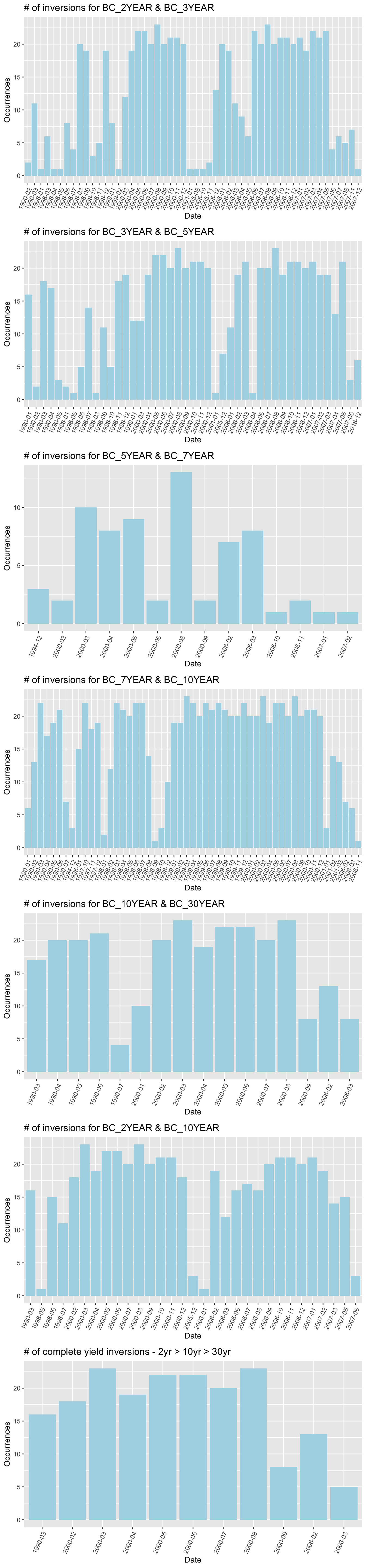
We can see that the most common inversions since 1990 are the 7-year/10-year (877 times), 2-year/3-year (667 times), 3-year/5-year (649 times), and 2-year/10-year(508 times). What I like to classify as a “Across-the-board” inversion (2-yr > 10-yr > 30-yr) has occured only 189 times since 1990. The rarest pair of inversion is surprisignly the 5-year/7-year yield, occuring only 69 times since 1990.
#Yield curve - YTD changes Now, let us view the way the yield curve has changed since the start of 2018. Maybe this can paint a better picture by showing us the momentum in which the yield curve has been inverting. We will take 5 different time frames to plot our yield curve by using the seq and floor functions and setting the number of periods to 5. First, we need to convert our data frame from “wide” format to “long” format. This means we convert all of our columns into their own rows with corresponding value’s. This will take our dimensions of the data frame from 7244, 10 to 56011, 3 with dates, maturities, and rates as the columns. This will allow us to index by our generated sequence dates for each yield on the yield curve. Once we index by our sequence dates, we can then plot away to view YTD changes in our yield curve.
#Change to long format, and convert maturity to factor
my_yc_gather <-  gather(data = my_yc,
                  key = "maturity",
                  value = "rate",
                  -ref_date)

my_yc_gather$maturity <- as.factor(my_yc_gather$maturity)


#Change maturity year name from BC_YEAR to just year number.
#([0-9]+) is a regex expression that extracts all numbers within a string - This takes the
#1 year, 2 year, 3 year, 5 year, 10 year, etc. Also, remove 10/2-year spread that became NA's
out <- str_extract_all(string = my_yc_gather$maturity,
                       pattern = "([0-9]+)")

my_yc_gather$maturity <- as.numeric(out)
my_yc_gather <- na.omit(my_yc_gather)


periods <- 5  #Set number of periods we want to plot

#Set sequence of observations for time period your interested in
my_seq <- floor(seq(1,nrow(my_yc_2018), length.out = periods))

my_dates <- my_yc_2018$ref_date[my_seq]     #Get actual dates from sequence

idx <- my_yc_gather$ref_date %in% my_dates  #Find dates in our data that match the seq dates
my_yc_seq <- my_yc_gather[idx, ]            #Index by these dates


#Set today's yield curve plot! First get the most recent date and filter.
idx_date <- max(my_yc_gather$ref_date)
last_date <- my_yc_gather %>% filter(my_yc_gather$ref_date == idx_date)

p2 <- ggplot(last_date, aes(x=maturity, y=rate)) + geom_point(size=2) + geom_line(size=1) + labs(x = "Maturity (years)", y="Yield Rate", title = paste0("US Yield Curve (",idx_date,")")) + coord_x_date(ylim = c(2.6,3.2)) + theme_tq()

#Set YTD Plot!
p3 <- ggplot(my_yc_seq, aes(x=maturity, y=rate, color= factor(ref_date))) + geom_point(size=2.5) + geom_line(size=.75) + labs(x = 'Maturity (years)', y='Yield Rate %', title = 'US Yield Curve YTD')

#Print today's yield curve
print(p2)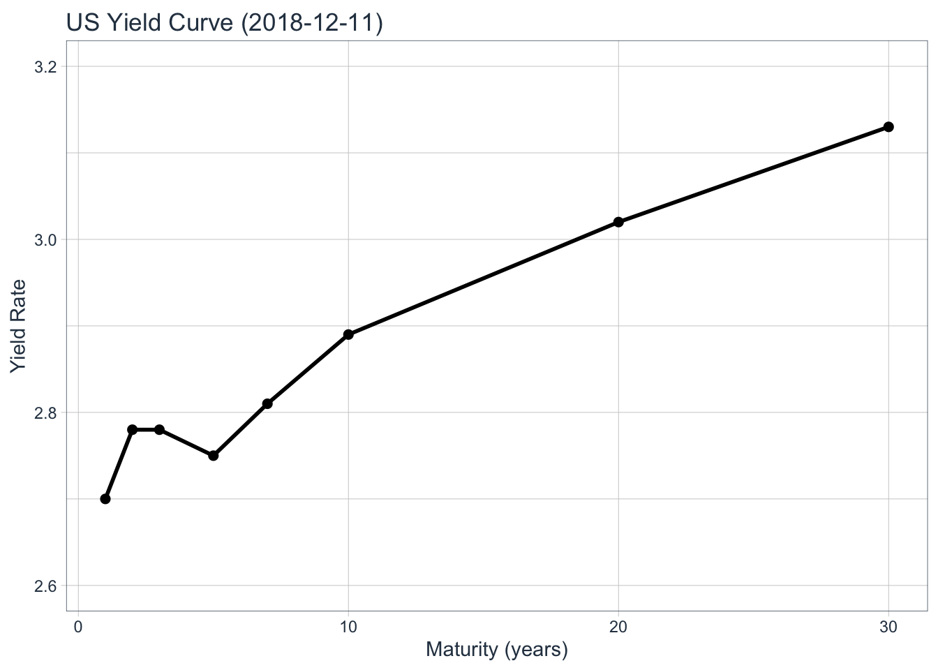
#Print YTD yield curve
print(p3)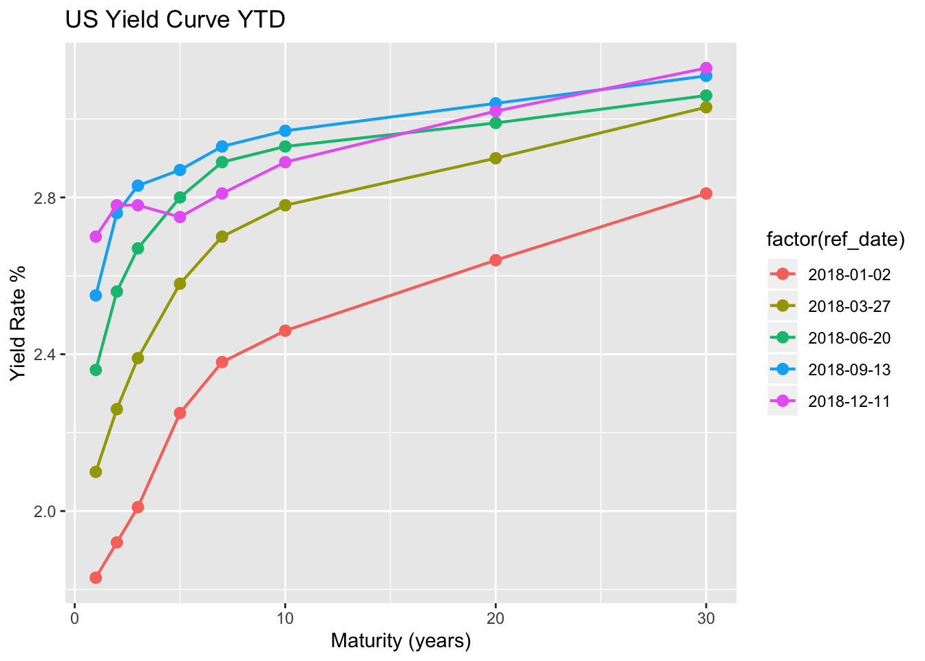
#What can we takeaway from this? Most of the inversions happened in the years of 1990, 2000, and 2006-2007. The post savings and loan crisis in 1990, the dot com bubble in 2000, and the financial crisis of 2007 (right now we are dealing with US/China trade issues, high wage growth that the FED views as inflationary, etc). All three time frames were during recessions but did they all result in a bear market (defined as a decline of 20%)? In theory, the answer is no. The only 20%+ market declines during these three year periods were in 2000 and 2007. Although, if we analyze a little closer we can see the answer should be YES! If we were to classify a Bear market as a decline of +19.9%, only 10 basis under the current 20% classification, then yes; all three year periods resulted in a Bear market (July-October/1990 incurred 19.92% loss).
If we were to use the “Across-the-board” inversion as an indicator, then the Bear market began 7 months after the inversions in 1990, 1 month after the first inversion in 2000, and 19 months after the 2006 inversions. As of 12-11-2018, the 2/10-year spread closed at 11 Basis Points, a -15.38 % change from yesterday and the 10-year/30-year closed at 24 Basis Points, a -14.29 % change from yesterday. What this tells me is that although we see some slight inversions on the short-end of the curve, which as we saw earlier occurs more often than the long-end, but the “Across-the-board” inversion has yet to happen. Even if this true inversion were to occur, then there is a possibility that we won’t see a bear market occur until a few months following the first inversion.
I do not believe we will enter a bear market due to the recent inversions in the yield curve. If you happen to be in the camp that does believe a bear market is coming, then most likely you believe that the U.S and China trade spat will only worsen from here. This could mean that either no deal is reached for a long period of time, additional tariffs, or a unfavorable deal is reached. I believe it is extremely hard to predict what two countries will settle on, when a deal is reached, or how it will affect the markets today. This is why I prefer buying into value and playing the long game rather than trying to predict how yield curve inversions and investor sentiment can affect markets short-term. All in all, I believe the FED will continue to watch closely before continuing to pump up the short end of the curve and we most likely will not see a lasting bear market if a true inversion were play out.
